10 Rules Of Measurement For A Cosy Home
Your home is your canvas, the one place where you can give free license to your artistic spirit.
However, good interior design is not all about art, it’s about math too.
Do you often catch yourself bumping your knee against the table? Do you struggle to not stub your toe into the legs of your bed? While you may have been putting these accidents down to clumsiness, it is possible that your furniture is just not where it is supposed to be.
A few rules of thumb can iron out the kinks in your space and turn it into a functional, comfortable haven.
The Living Room
Rule #1
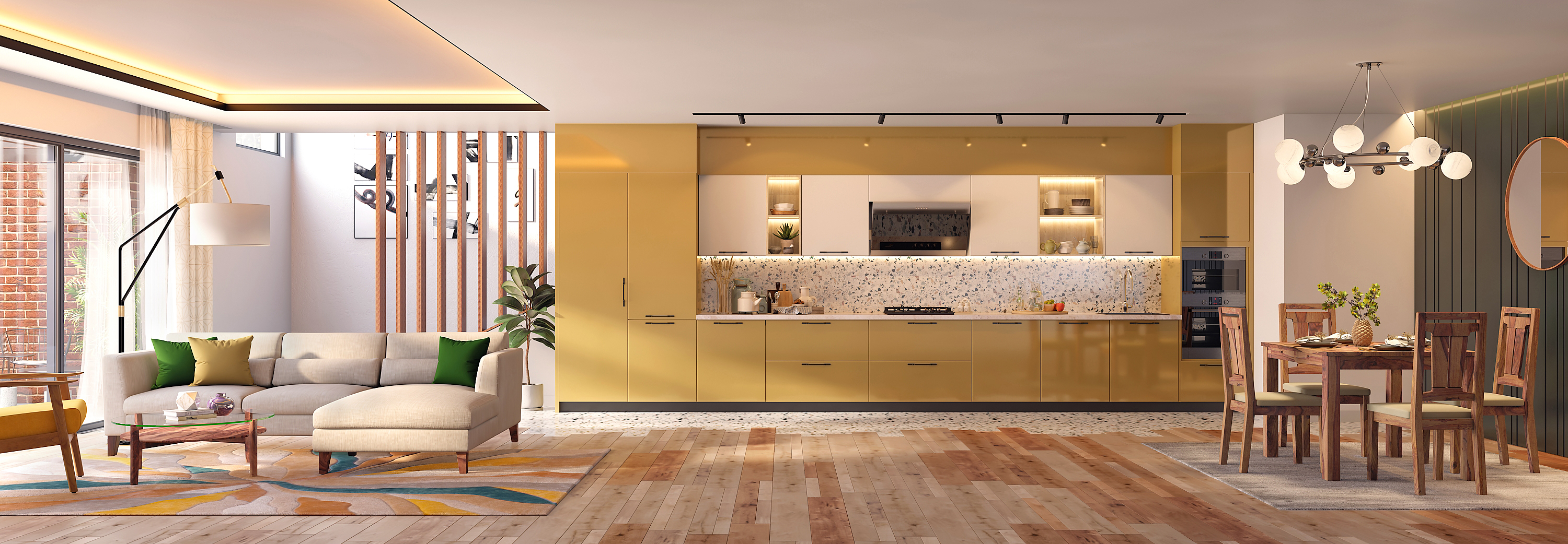
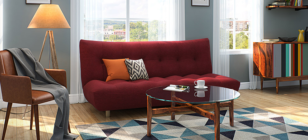
If you've listened to any advice on interior design, you've probably heard that a coffee table makes a great focal point for your living room. While this is true, you need to ensure that the coffee table is not so large that it overpowers your sofa. The distance between your sofa and your coffee table is a crucial consideration too, both to you and to unsuspecting guests who’d very much rather not get bruised by your furniture. Remember, the coffee table must be far away enough to provide ample legroom but close enough for you to set down mugs comfortably. We recommend a gap of about 14 to 18 inches.
Rule #2
Televisions are best positioned when viewers look down, ever so slightly, on the screen. This prevents troublesome glares and annoyed friends. For precise positioning, the centre of the TV should be 30 inches above the lowest seat in the room. If you’re planning to get a TV unit that can double up as a bookshelf, keep in mind that a depth of 12 inches is ideal for most books.
Rule #3
Don’t shrug off the idea of a rug. Rugs add colour, charm and character to your space. For large spaces, the area rug could be about 24 inches from the wall, while for smaller spaces, 12 to 18 inches should do. Most designers prefer it if at least two legs of every chair and sofa find a place on the area rug. This creates a comfortable conversational space within the larger context of the living room.
Rule #4
One of the most important considerations in room layouts, is ensuring that the paths to enter and exit the room are clear of clutter. After all, you’re trying to create a welcoming home, not an obstacle course. So, ensure you have at least 30 – 36 inches of a walkway between furniture.
The Bedroom
Rule #5
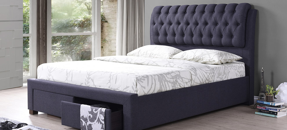
While the bed is the obvious focal point of the bedroom, you should take care not to let it crowd the room. To achieve this, several designers use the 60:30:10 ratio (often called the Golden Ratio). 60% of your floor space ought to be devoted to furniture, so if you want dressers, chairs et al, use the 60% wisely. 30% of the floor space is for the walkway, and 10% for odds and ends – plants, lamps and so on.
Rule #6
To create a balanced layout in your bedroom, place the largest furniture, that is, the bed, first and then fit in the smaller pieces. This can help you gauge when to stop, so you don't end up with a bedroom that looks like a storeroom.
The Kitchen
Rule #7
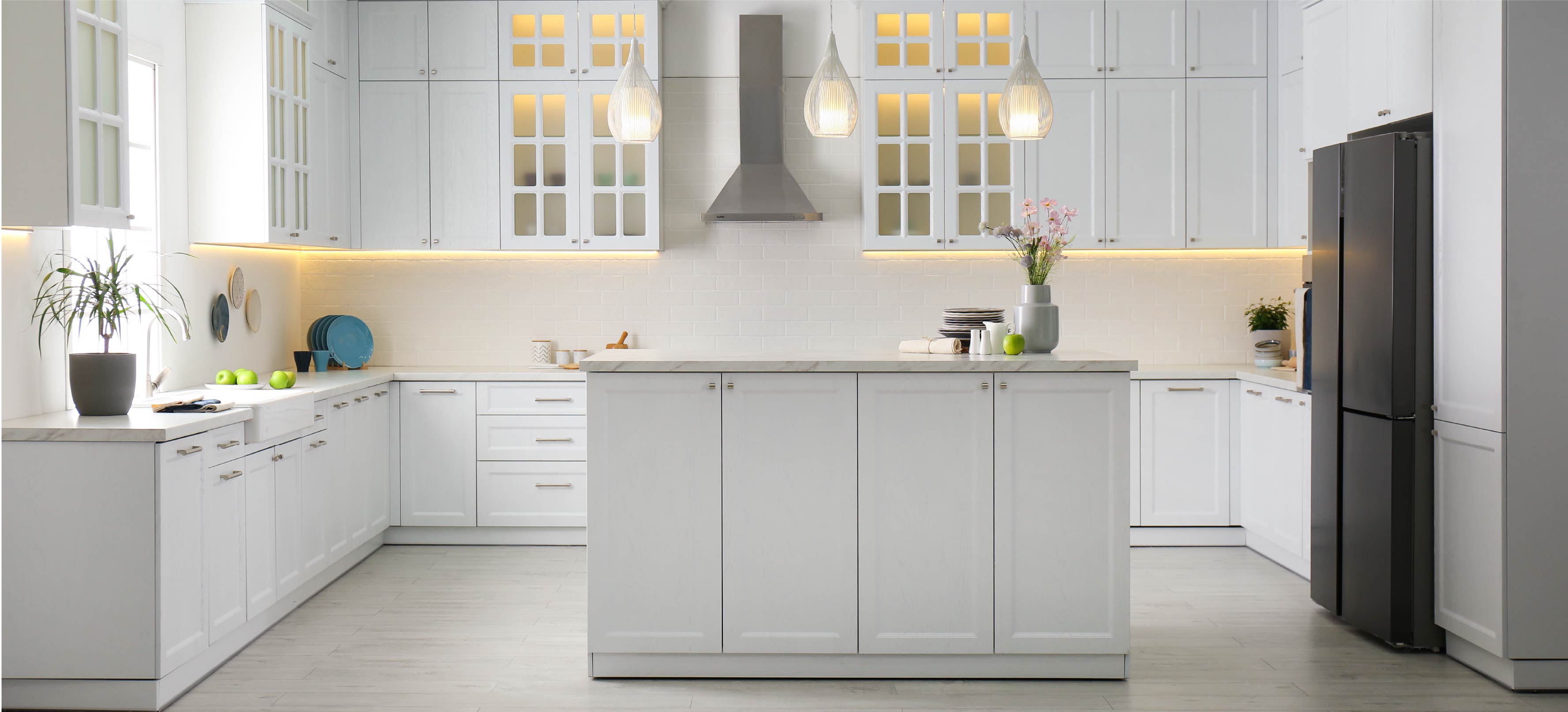
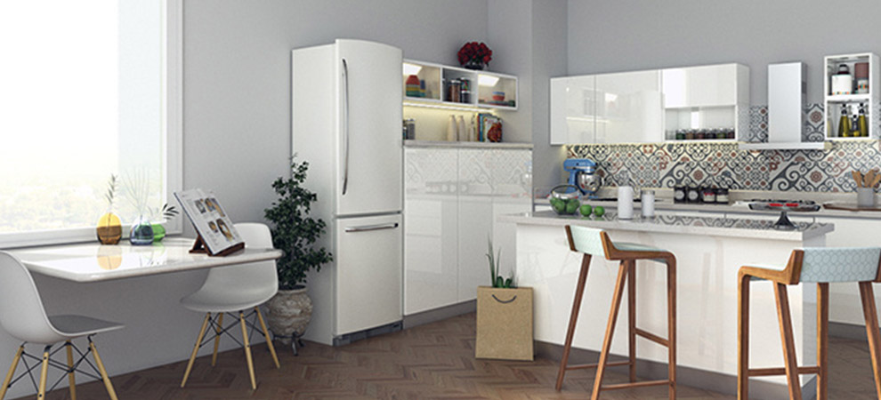
Kitchens are compact and heavy on storage and mobility requirements. No wonder then, that every inch matters. For a functional, ergonomic kitchen, create a ‘Work Triangle.’ The three points of this triangle are the stove, the fridge and the sink. Each side of the triangle should be no less than 15 inches and no more than 25 inches.
Rule #8
If you have a seating space within the kitchen it should be outside the work triangle. A countertop that is atleast 24 inches wide and has a minimum clearance of 15 inches above is best to mix, knead and chop comfortably.
Rule #9
If your kitchen is a small space, don’t forget to note which way cabinet and appliance doors swing open. Overlapping doors can get you stuck in the middle of a recipe and induce kitchen fiascos (and kitchen hysterics).
Rule #10
Good kitchen design isn’t just about the cooking area, it should also consider the ease of unloading groceries and washing dishes. Ideally, a sink should have ‘landing areas’ or wings of at least 24 inches on one side and 18 on the other.
While a beautifully designed home owes a lot of its charm to visually appealing colours, prints and furniture, what really ties it together is a cohesive design plan. Shirk not this necessary step. Instead, get your inch-tape and notepad and do a little surveying!
Do you have any other design or layout tips you'd like to share? We'd love to hear what worked for you and what didn't! Tell us, don't hold back.
